E-commerce revamp for PC's The Mobile Shop.
A case showing how an improved e-commerce shopping UX unlocked online cross-carrier buying for 20 million President's Choice Customers.
ROLE: Product Designer - Usability Research, Visual Design, Prototyping
Overview
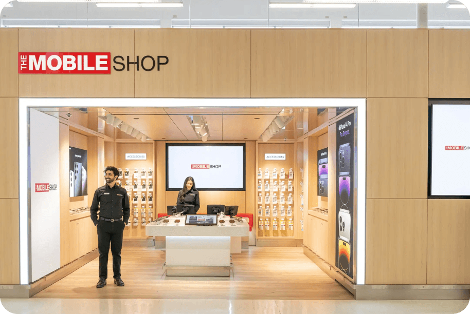
The Mobile Shop is the leading 3rd party telecom retailer marketing towards PC Loyalty customers in Canada. Its e-commerce website was riddled with poor design that caused a low conversion among customers.
Solution
A revamp of key experience bottlenecks in the online phone purchase flow, to bring process clarity to our PC shoppers.
Research Findings to
support solution thesis
1 in 3 vistors
dropped off on the product page
Conversion were disappointing on the background of pandemic e-commerce boom.
Only 10% reservations turned up.
Clunky user experience meant virtually all customers needed to ne reminded to pick up their phones.
Bad user sentiment with online experience
Poor web design experience tested poorly in marketing focus groups.
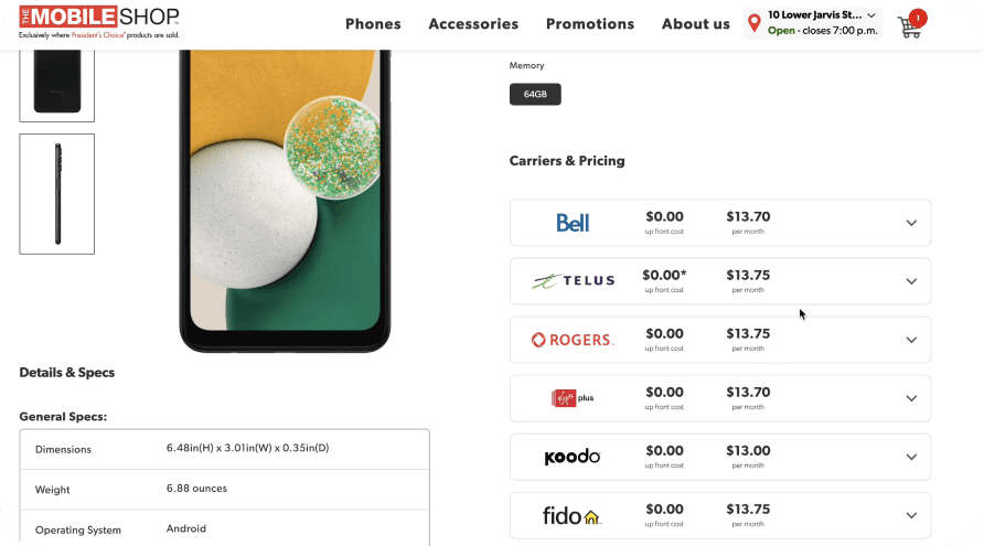
Current Product page flow

GOAL
Minimize experience frictions and increase conversions
in the online shopping experience
Revamped Product Page
1
3
2
Issues with current:
Visually cluttered product page.
New navigation frames page better, page not laid out against a grid
Customers loose site of the phone being considered within very short scroll progression
4
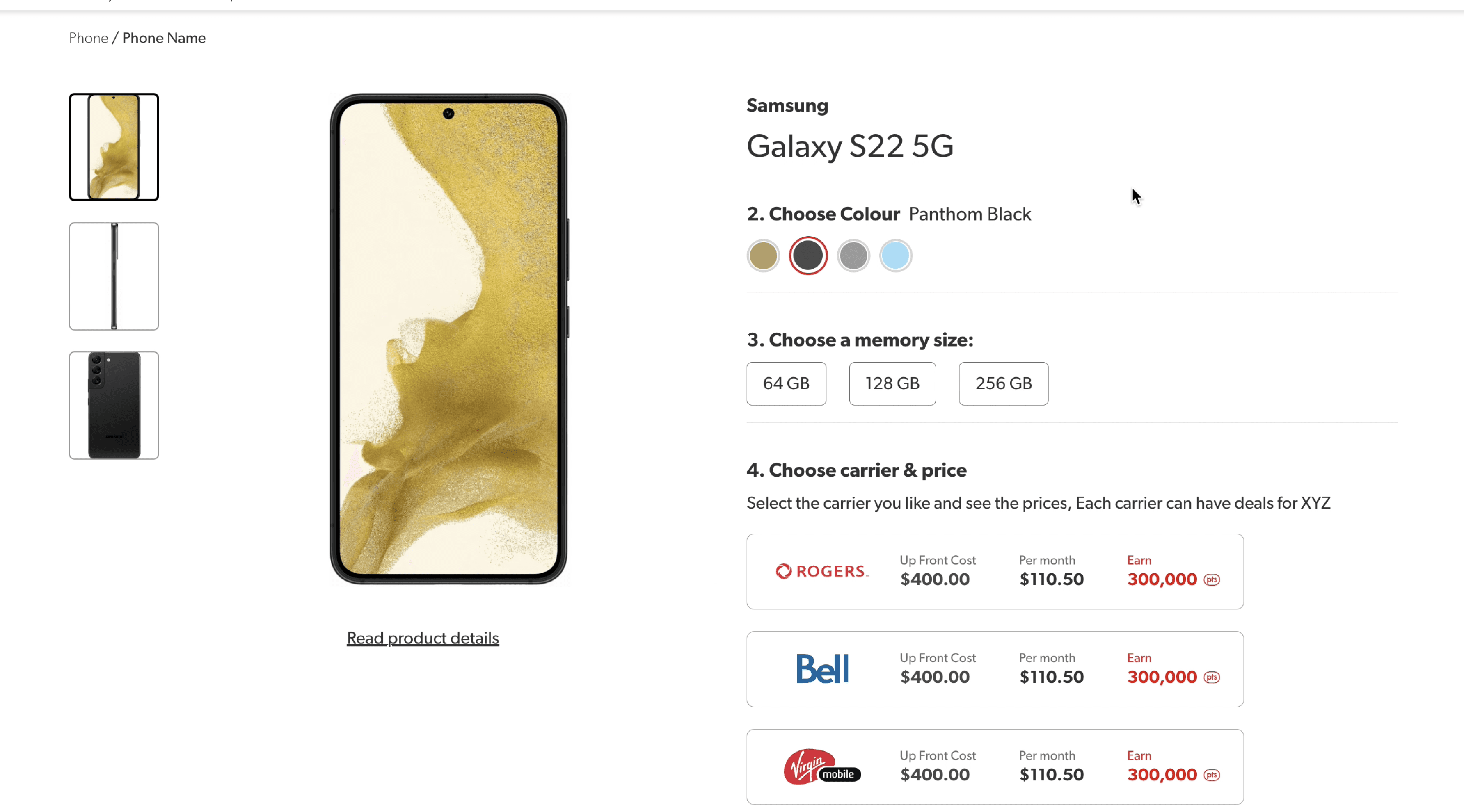
Revamped Changes:
Paired down visual clutter
Introduced 8 column grid to create consistent spacing
Fixed phone hero photo as a sticky element on desktop to keep product in view.
Introduced progressive form jump scrolls
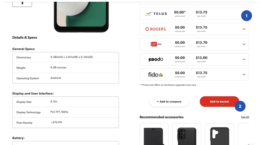
Issues with current:
Customers struggled to understand the pricing. Assumed prices where phone prices vs discounts.
Add to Basket paradigm was confusing because the site did not have a accessible cart
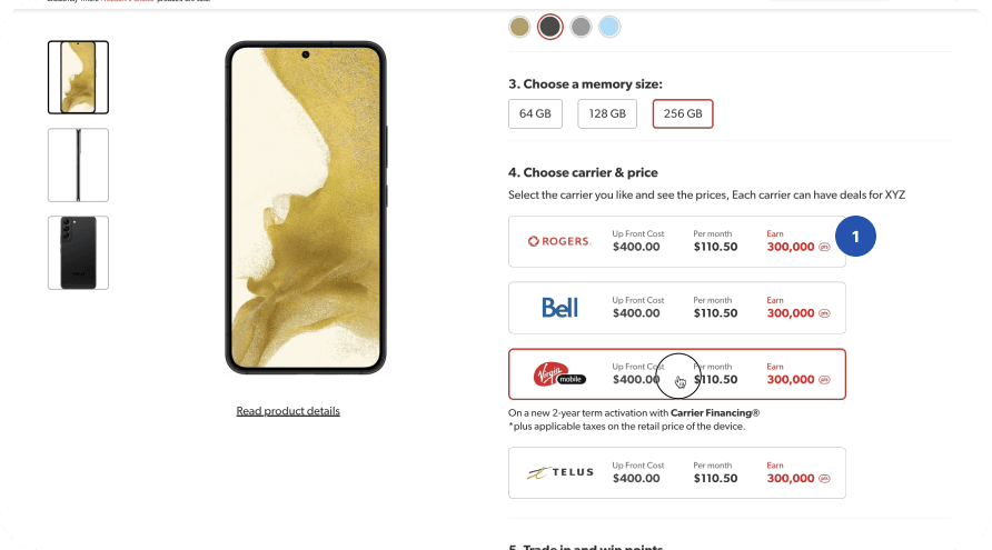
Revamped Changes:
Correct and relevant prices show to customers to understand points and prices
CTA more points customers to “Reserve in Store”
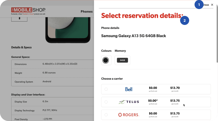
Issues with current:
Unexpected modal takes over the screen. Dialogue/form repeats.
Copy introduces concept of reservation while customers expected a basket. Reservation details
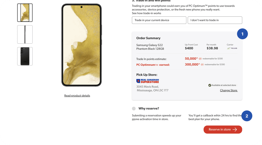
Revamped Changes:
Modal is removed. In palce, order summary is shown to represent order
Copy Introduces reservation paradigm to customers.
Internal feedback
PC Customer
Moderated and unmoderated testing with 20 participants sourced from people in market for a phone. (Playbook UX)
Results showed strong success rate for all tasks with new design
Testers seemed to understand the value of PC points
After Launch: Initial MVP launch saw 70% reduction in drop offs
Internal feedback
PMs & Engineering
Feedback gathered form internal cross functional teams
“...I didn’t think it was the UX that was encouraging drop offs.”
“We need to build these prototypes before we begin the project...”
Conclusion & Learnings
The Mobile Shop sales to pick up in monthly sales
In-store staff reported that pick-up customers seemed to understand the value of PC points
Front line staff know a lot more about the customer than product teams.
Design shepherding in a non design driven company requires the right balance lof proving in data and story telling.

Overview
The Mobile Shop is the leading 3rd party telecom retailer marketing towards PC Loyalty customers in Canada. Its e-commerce website was riddled with poor design that caused a low conversion among customers.
Solution
A revamp of key experience bottlenecks in the online phone purchase flow, to bring process clarity to our PC shoppers.

Research Findings to
support solution thesis
1 in 3 vistors
dropped off on the product page
Conversion were disappointing on the background of pandemic e-commerce boom.
Only 10% reservations turned up.
Clunky user experience meant virtually all customers needed to ne reminded to pick up their phones.
Bad user sentiment with online experience
Poor web design experience tested poorly in marketing focus groups.
Current Product page flow

GOAL
Minimize experience frictions and increase conversions
in the online shopping experience
Revamped Product Page

1
3
2
Issues with current:
Visually cluttered product page.
New navigation frames page better, page not laid out against a grid
Customers loose site of the phone being considered within very short scroll progression

4
Revamped Changes:
Paired down visual clutter
Introduced 8 column grid to create consistent spacing
Fixed phone hero photo as a sticky element on desktop to keep product in view.
Introduced progressive form jump scrolls

Issues with current:
Customers struggled to understand the pricing. Assumed prices where phone prices vs discounts.
Add to Basket paradigm was confusing because the site did not have a accessible cart

Revamped Changes:
Correct and relevant prices show to customers to understand points and prices
CTA more points customers to “Reserve in Store”

Issues with current:
Unexpected modal takes over the screen. Dialogue/form repeats.
Copy introduces concept of reservation while customers expected a basket. Reservation details

Revamped Changes:
Modal is removed. In palce, order summary is shown to represent order
Copy Introduces reservation paradigm to customers.
Internal feedback
PC Customer
Moderated and unmoderated testing with 20 participants sourced from people in market for a phone. (Playbook UX)
Results showed strong success rate for all tasks with new design
Testers seemed to understand the value of PC points
After Launch: Initial MVP launch saw 70% reduction in drop offs
Internal feedback
PMs & Engineering
Feedback gathered form internal cross functional teams
“...I didn’t think it was the UX that was encouraging drop offs.”
“We need to build these prototypes before we begin the project...”
Conclusion & Learnings
The Mobile Shop sales to pick up in monthly sales
In-store staff reported that pick-up customers seemed to understand the value of PC points
Front line staff know a lot more about the customer than product teams.
Design shepherding in a non design driven company requires the right balance lof proving in data and story telling.

Overview
The Mobile Shop is the leading 3rd party telecom retailer marketing towards PC Loyalty customers in Canada. Its e-commerce website was riddled with poor design that caused a low conversion among customers.
Solution
A revamp of key experience bottlenecks in the online phone purchase flow, to bring process clarity to our PC shoppers.

Research Findings to
support solution thesis
1 in 3 vistors
dropped off on the product page
Conversion were disappointing on the background of pandemic e-commerce boom.
Only 10% reservations turned up.
Clunky user experience meant virtually all customers needed to ne reminded to pick up their phones.
Bad user sentiment with online experience
Poor web design experience tested poorly in marketing focus groups.
Current Product page flow

GOAL
Minimize experience frictions and increase conversions
in the online shopping experience
Revamped Product Page

1
3
2
Issues with current:
Visually cluttered product page.
New navigation frames page better, page not laid out against a grid
Customers loose site of the phone being considered within very short scroll progression

4
Revamped Changes:
Paired down visual clutter
Introduced 8 column grid to create consistent spacing
Fixed phone hero photo as a sticky element on desktop to keep product in view.
Introduced progressive form jump scrolls

Issues with current:
Customers struggled to understand the pricing. Assumed prices where phone prices vs discounts.
Add to Basket paradigm was confusing because the site did not have a accessible cart

Revamped Changes:
Correct and relevant prices show to customers to understand points and prices
CTA more points customers to “Reserve in Store”

Issues with current:
Unexpected modal takes over the screen. Dialogue/form repeats.
Copy introduces concept of reservation while customers expected a basket. Reservation details

Revamped Changes:
Modal is removed. In palce, order summary is shown to represent order
Copy Introduces reservation paradigm to customers.
Internal feedback
PC Customer
Moderated and unmoderated testing with 20 participants sourced from people in market for a phone. (Playbook UX)
Results showed strong success rate for all tasks with new design
Testers seemed to understand the value of PC points
After Launch: Initial MVP launch saw 70% reduction in drop offs
Internal feedback
PMs & Engineering
Feedback gathered form internal cross functional teams
“...I didn’t think it was the UX that was encouraging drop offs.”
“We need to build these prototypes before we begin the project...”
Conclusion & Learnings
The Mobile Shop sales to pick up in monthly sales
In-store staff reported that pick-up customers seemed to understand the value of PC points
Front line staff know a lot more about the customer than product teams.
Design shepherding in a non design driven company requires the right balance lof proving in data and story telling.

Overview
The Mobile Shop is the leading 3rd party telecom retailer marketing towards PC Loyalty customers in Canada. Its e-commerce website was riddled with poor design that caused a low conversion among customers.
Solution
A revamp of key experience bottlenecks in the online phone purchase flow, to bring process clarity to our PC shoppers.

Research Findings to
support solution thesis
1 in 3 vistors
dropped off on the product page
Conversion were disappointing on the background of pandemic e-commerce boom.
Only 10% reservations turned up.
Clunky user experience meant virtually all customers needed to ne reminded to pick up their phones.
Bad user sentiment with online experience
Poor web design experience tested poorly in marketing focus groups.
Current Product page flow

GOAL
Minimize experience frictions and increase conversions
in the online shopping experience
Revamped Product Page

1
3
2
Issues with current:
Visually cluttered product page.
New navigation frames page better, page not laid out against a grid
Customers loose site of the phone being considered within very short scroll progression

4
Revamped Changes:
Paired down visual clutter
Introduced 8 column grid to create consistent spacing
Fixed phone hero photo as a sticky element on desktop to keep product in view.
Introduced progressive form jump scrolls

Issues with current:
Customers struggled to understand the pricing. Assumed prices where phone prices vs discounts.
Add to Basket paradigm was confusing because the site did not have a accessible cart

Revamped Changes:
Correct and relevant prices show to customers to understand points and prices
CTA more points customers to “Reserve in Store”

Issues with current:
Unexpected modal takes over the screen. Dialogue/form repeats.
Copy introduces concept of reservation while customers expected a basket. Reservation details

Revamped Changes:
Modal is removed. In palce, order summary is shown to represent order
Copy Introduces reservation paradigm to customers.
Internal feedback
PC Customer
Moderated and unmoderated testing with 20 participants sourced from people in market for a phone. (Playbook UX)
Results showed strong success rate for all tasks with new design
Testers seemed to understand the value of PC points
After Launch: Initial MVP launch saw 70% reduction in drop offs
Internal feedback
PMs & Engineering
Feedback gathered form internal cross functional teams
“...I didn’t think it was the UX that was encouraging drop offs.”
“We need to build these prototypes before we begin the project...”
Conclusion & Learnings
The Mobile Shop sales to pick up in monthly sales
In-store staff reported that pick-up customers seemed to understand the value of PC points
Front line staff know a lot more about the customer than product teams.
Design shepherding in a non design driven company requires the right balance lof proving in data and story telling.

Overview
The Mobile Shop is the leading 3rd party telecom retailer marketing towards PC Loyalty customers in Canada. Its e-commerce website was riddled with poor design that caused a low conversion among customers.
Solution
A revamp of key experience bottlenecks in the online phone purchase flow, to bring process clarity to our PC shoppers.

Research Findings to
support solution thesis
1 in 3 vistors
dropped off on the product page
Conversion were disappointing on the background of pandemic e-commerce boom.
Only 10% reservations turned up.
Clunky user experience meant virtually all customers needed to ne reminded to pick up their phones.
Bad user sentiment with online experience
Poor web design experience tested poorly in marketing focus groups.
Current Product page flow

GOAL
Minimize experience frictions and increase conversions
in the online shopping experience
Revamped Product Page

1
3
2
Issues with current:
Visually cluttered product page.
New navigation frames page better, page not laid out against a grid
Customers loose site of the phone being considered within very short scroll progression

4
Revamped Changes:
Paired down visual clutter
Introduced 8 column grid to create consistent spacing
Fixed phone hero photo as a sticky element on desktop to keep product in view.
Introduced progressive form jump scrolls

Issues with current:
Customers struggled to understand the pricing. Assumed prices where phone prices vs discounts.
Add to Basket paradigm was confusing because the site did not have a accessible cart

Revamped Changes:
Correct and relevant prices show to customers to understand points and prices
CTA more points customers to “Reserve in Store”

Issues with current:
Unexpected modal takes over the screen. Dialogue/form repeats.
Copy introduces concept of reservation while customers expected a basket. Reservation details

Revamped Changes:
Modal is removed. In palce, order summary is shown to represent order
Copy Introduces reservation paradigm to customers.
Internal feedback
PC Customer
Moderated and unmoderated testing with 20 participants sourced from people in market for a phone. (Playbook UX)
Results showed strong success rate for all tasks with new design
Testers seemed to understand the value of PC points
After Launch: Initial MVP launch saw 70% reduction in drop offs
Internal feedback
PMs & Engineering
Feedback gathered form internal cross functional teams
“...I didn’t think it was the UX that was encouraging drop offs.”
“We need to build these prototypes before we begin the project...”
Conclusion & Learnings
The Mobile Shop sales to pick up in monthly sales
In-store staff reported that pick-up customers seemed to understand the value of PC points
Front line staff know a lot more about the customer than product teams.
Design shepherding in a non design driven company requires the right balance lof proving in data and story telling.

Overview
The Mobile Shop is the leading 3rd party telecom retailer marketing towards PC Loyalty customers in Canada. Its e-commerce website was riddled with poor design that caused a low conversion among customers.
Solution
A revamp of key experience bottlenecks in the online phone purchase flow, to bring process clarity to our PC shoppers.

Research Findings to
support solution thesis
1 in 3 vistors
dropped off on the product page
Conversion were disappointing on the background of pandemic e-commerce boom.
Only 10% reservations turned up.
Clunky user experience meant virtually all customers needed to ne reminded to pick up their phones.
Bad user sentiment with online experience
Poor web design experience tested poorly in marketing focus groups.
Current Product page flow

GOAL
Minimize experience frictions and increase conversions
in the online shopping experience
Revamped Product Page

1
3
2
Issues with current:
Visually cluttered product page.
New navigation frames page better, page not laid out against a grid
Customers loose site of the phone being considered within very short scroll progression

4
Revamped Changes:
Paired down visual clutter
Introduced 8 column grid to create consistent spacing
Fixed phone hero photo as a sticky element on desktop to keep product in view.
Introduced progressive form jump scrolls

Issues with current:
Customers struggled to understand the pricing. Assumed prices where phone prices vs discounts.
Add to Basket paradigm was confusing because the site did not have a accessible cart

Revamped Changes:
Correct and relevant prices show to customers to understand points and prices
CTA more points customers to “Reserve in Store”

Issues with current:
Unexpected modal takes over the screen. Dialogue/form repeats.
Copy introduces concept of reservation while customers expected a basket. Reservation details

Revamped Changes:
Modal is removed. In palce, order summary is shown to represent order
Copy Introduces reservation paradigm to customers.
Internal feedback
PC Customer
Moderated and unmoderated testing with 20 participants sourced from people in market for a phone. (Playbook UX)
Results showed strong success rate for all tasks with new design
Testers seemed to understand the value of PC points
After Launch: Initial MVP launch saw 70% reduction in drop offs
Internal feedback
PMs & Engineering
Feedback gathered form internal cross functional teams
“...I didn’t think it was the UX that was encouraging drop offs.”
“We need to build these prototypes before we begin the project...”
Conclusion & Learnings
The Mobile Shop sales to pick up in monthly sales
In-store staff reported that pick-up customers seemed to understand the value of PC points
Front line staff know a lot more about the customer than product teams.
Design shepherding in a non design driven company requires the right balance lof proving in data and story telling.

Overview
The Mobile Shop is the leading 3rd party telecom retailer marketing towards PC Loyalty customers in Canada. Its e-commerce website was riddled with poor design that caused a low conversion among customers.
Solution
A revamp of key experience bottlenecks in the online phone purchase flow, to bring process clarity to our PC shoppers.

Research Findings to
support solution thesis
1 in 3 vistors
dropped off on the product page
Conversion were disappointing on the background of pandemic e-commerce boom.
Only 10% reservations turned up.
Clunky user experience meant virtually all customers needed to ne reminded to pick up their phones.
Bad user sentiment with online experience
Poor web design experience tested poorly in marketing focus groups.
Current Product page flow

GOAL
Minimize experience frictions and increase conversions
in the online shopping experience
Revamped Product Page

1
3
2
Issues with current:
Visually cluttered product page.
New navigation frames page better, page not laid out against a grid
Customers loose site of the phone being considered within very short scroll progression

4
Revamped Changes:
Paired down visual clutter
Introduced 8 column grid to create consistent spacing
Fixed phone hero photo as a sticky element on desktop to keep product in view.
Introduced progressive form jump scrolls

Issues with current:
Customers struggled to understand the pricing. Assumed prices where phone prices vs discounts.
Add to Basket paradigm was confusing because the site did not have a accessible cart

Revamped Changes:
Correct and relevant prices show to customers to understand points and prices
CTA more points customers to “Reserve in Store”

Issues with current:
Unexpected modal takes over the screen. Dialogue/form repeats.
Copy introduces concept of reservation while customers expected a basket. Reservation details

Revamped Changes:
Modal is removed. In palce, order summary is shown to represent order
Copy Introduces reservation paradigm to customers.
Internal feedback
PC Customer
Moderated and unmoderated testing with 20 participants sourced from people in market for a phone. (Playbook UX)
Results showed strong success rate for all tasks with new design
Testers seemed to understand the value of PC points
After Launch: Initial MVP launch saw 70% reduction in drop offs
Internal feedback
PMs & Engineering
Feedback gathered form internal cross functional teams
“...I didn’t think it was the UX that was encouraging drop offs.”
“We need to build these prototypes before we begin the project...”
Conclusion & Learnings
The Mobile Shop sales to pick up in monthly sales
In-store staff reported that pick-up customers seemed to understand the value of PC points
Front line staff know a lot more about the customer than product teams.
Design shepherding in a non design driven company requires the right balance lof proving in data and story telling.

Overview
The Mobile Shop is the leading 3rd party telecom retailer marketing towards PC Loyalty customers in Canada. Its e-commerce website was riddled with poor design that caused a low conversion among customers.
Solution
A revamp of key experience bottlenecks in the online phone purchase flow, to bring process clarity to our PC shoppers.

Research Findings to
support solution thesis
1 in 3 vistors
dropped off on the product page
Conversion were disappointing on the background of pandemic e-commerce boom.
Only 10% reservations turned up.
Clunky user experience meant virtually all customers needed to ne reminded to pick up their phones.
Bad user sentiment with online experience
Poor web design experience tested poorly in marketing focus groups.
Current Product page flow

GOAL
Minimize experience frictions and increase conversions
in the online shopping experience
Revamped Product Page

1
3
2
Issues with current:
Visually cluttered product page.
New navigation frames page better, page not laid out against a grid
Customers loose site of the phone being considered within very short scroll progression

4
Revamped Changes:
Paired down visual clutter
Introduced 8 column grid to create consistent spacing
Fixed phone hero photo as a sticky element on desktop to keep product in view.
Introduced progressive form jump scrolls

Issues with current:
Customers struggled to understand the pricing. Assumed prices where phone prices vs discounts.
Add to Basket paradigm was confusing because the site did not have a accessible cart

Revamped Changes:
Correct and relevant prices show to customers to understand points and prices
CTA more points customers to “Reserve in Store”

Issues with current:
Unexpected modal takes over the screen. Dialogue/form repeats.
Copy introduces concept of reservation while customers expected a basket. Reservation details

Revamped Changes:
Modal is removed. In palce, order summary is shown to represent order
Copy Introduces reservation paradigm to customers.
Internal feedback
PC Customer
Moderated and unmoderated testing with 20 participants sourced from people in market for a phone. (Playbook UX)
Results showed strong success rate for all tasks with new design
Testers seemed to understand the value of PC points
After Launch: Initial MVP launch saw 70% reduction in drop offs
Internal feedback
PMs & Engineering
Feedback gathered form internal cross functional teams
“...I didn’t think it was the UX that was encouraging drop offs.”
“We need to build these prototypes before we begin the project...”
Conclusion & Learnings
The Mobile Shop sales to pick up in monthly sales
In-store staff reported that pick-up customers seemed to understand the value of PC points
Front line staff know a lot more about the customer than product teams.
Design shepherding in a non design driven company requires the right balance lof proving in data and story telling.

Revamped Product Page
Overview
The Mobile Shop is the leading 3rd party telecom retailer marketing towards PC Loyalty customers in Canada. Its e-commerce website was riddled with poor design that caused a low conversion among customers.
Solution
A revamp of key experience bottlenecks in the online phone purchase flow, to bring process clarity to our PC shoppers.


Research Findings to
support solution thesis
1 in 3 vistors
dropped off on the product page
Conversion were disappointing on the background of pandemic e-commerce boom.
Only 10% reservations turned up.
Clunky user experience meant virtually all customers needed to ne reminded to pick up their phones.
Bad user sentiment with online experience
Poor web design experience tested poorly in marketing focus groups.
Current Product page flow


GOAL
Minimize experience frictions and increase conversions
in the online shopping experience

1
3
2

1
3
2
Issues with Layout:
Visually cluttered product page.
New navigation frames page better, page not laid out against a grid
Customers loose site of the phone being considered within very short scroll progression

4

4
Revamped Layout:
Paired down visual clutter
Introduced 8 column grid to create consistent spacing
Fixed phone hero photo as a sticky element on desktop to keep product in view.
Introduced progressive form jump scrolls


Issues with Content:
Customers struggled to understand the pricing. Assumed prices where phone prices vs discounts.
Add to Basket paradigm was confusing because the site did not have a accessible cart


Revamped Content:
Correct and relevant prices show to customers to understand points and prices
CTA more points customers to “Reserve in Store”


Issues with Pricing:
Unexpected modal takes over the screen. Dialogue/form repeats.
Copy introduces concept of reservation while customers expected a basket. Reservation details


Revamped Pricing:
Modal is removed. In palce, order summary is shown to represent order
Copy Introduces reservation paradigm to customers.
Internal feedback
PC Customer
Moderated and unmoderated testing with 20 participants sourced from people in market for a phone. (Playbook UX)
Results showed strong success rate for all tasks with new design
Testers seemed to understand the value of PC points
After Launch: Initial MVP launch saw 70% reduction in drop offs
Internal feedback
PMs & Engineering
Feedback gathered form internal cross functional teams
“...I didn’t think it was the UX that was encouraging drop offs.”
“We need to build these prototypes before we begin the project...”
Conclusion & Learnings
The Mobile Shop sales to pick up in monthly sales
In-store staff reported that pick-up customers seemed to understand the value of PC points
Front line staff know a lot more about the customer than product teams.
Design shepherding in a non design driven company requires the right balance lof proving in data and story telling.

